![]()
If you’ve ever had to fiddle around with getting a Praat Picture to look and export just right in order to insert it in an R markdown file or slide deck, then this package is for you! Even if this isn’t the case, the package offers some very useful flexibility. It’s a simple set of functions designed to emulate some common plots made in Praat Picture with base R plotting. It allows for flexibly combining waveforms, spectrograms, TextGrids, pitch tracks, formant tracks, and intensity tracks in a single plot. The derived acoustic plots can all be generated directly in R, or (except in the case of spectrograms) generated in Praat.
TextGrids can be plotted as long as there is a file with the .TextGrid extension in the same directory and with the same base name as the sound file. If there are files with the .PitchTier, .Formant, and .IntensityTier extensions generated in Praat, these are loaded in using the rPraat package and used for plotting. Otherwise, signal processing functions from the wrassp package are used in a way that emulates Praat default settings as closely as possible. Spectrograms are generated with the phonTools package.
If you are an emuR user, the emupicture function will help make Praat Picture style plots of sound files, annotations, and possibly SSFF files from an EMU-database.
If you run into bugs or have suggested changes, please let me know!
You can install the latest development version of praatpicture like so:
The Praat Picture I see (and use) most commonly simply consists of a relatively small waveform, a larger spectrogram, and an aligned TextGrid. Accordingly this is very simple to make with praatpicture(). Simply pass the name of a sound file with the .wav extension to the function, and voila!

Often you won’t want to plot an entire sound file, but only a small portion of it. This is no problem – simply use the start and end arguments to tell R exactly what you want to plot. If we just want to plot the portion between 0.5–1.1 seconds of the above file, we do it like this:

Similar to the Praat defaults, only the start and end times are shown at the bottom of the plot, and only highest frequencies and lowest frequencies are shown next to the spectrogram, etc. We can generate more “R-like” axis ticks by setting the arguments min_max_only = FALSE and start_end_only = FALSE. If we want to keep the original time on the x-axis, this can be controlled with the argument tfrom0 = FALSE.
praatpicture('inst/extdata/3.wav', start=0.5, end=1.1, min_max_only=FALSE,
             start_end_only=FALSE, tfrom0=FALSE)
The frames argument controls what kind of plot components we see. If we weren’t interested in the TextGrid, we could set it to frames=c('sound', 'spectrogram'). The proportion argument controls how much space is taken up by each component; in this case, we probably want a spectrogram that’s a little larger than the waveform, which can be done with e.g. proportion=c(40,60), setting aside 40% of the plotting area for the waveform and 60% for the spectrogram.
praatpicture('inst/extdata/3.wav', start=0.5, end=1.1,
             frames=c('sound', 'spectrogram'), proportion=c(40,60))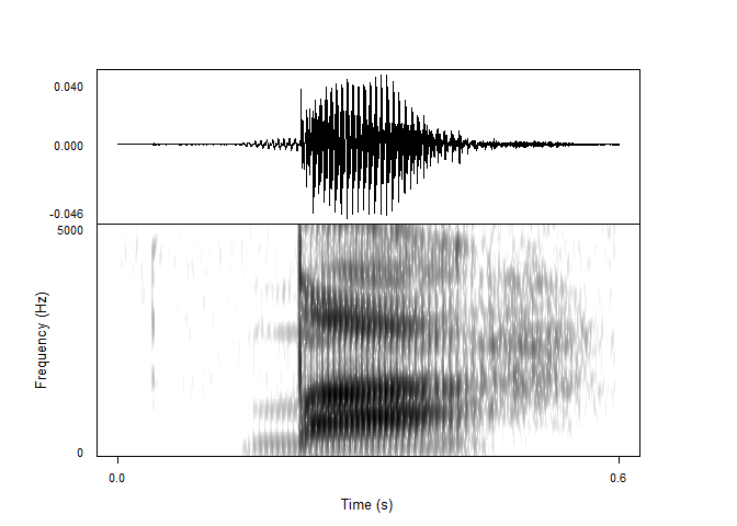
By default, all channels of a sound file are plotted. This can be changed with the wave_channels argument. If you want names next to individual channels, this can be achieved with the wave_channelNames argument, which is set to FALSE by default. If you want to plot the waveform in a different color than black, this is controlled with the wave_color argument:
praatpicture('inst/extdata/3.wav', start=0.5, end=1.1,
             frames=c('sound', 'spectrogram'), proportion=c(20,80),
             wave_color='grey')
By default, all tiers in the TextGrid are plotted. If we want to plot different tiers, we can tell R using the tiers argument. If we were only interested in the second and third tiers, we could call tiers=c(2,3). The tg_focusTier argument controls for which tiers dotted lines are plotted on all plot components (this can be a number, but could also be 'all' or 'none'. If we are not interested in having names next to the tiers, we can set tg_tierNames=FALSE.
praatpicture('inst/extdata/3.wav', start=0.5, end=1.1,
             tg_tiers=c(2,3), tg_focusTier=3, tg_tierNames=FALSE)
By default, text is center aligned, but we can also align it to the left or to the right with the tg_alignment argument. This doesn’t have to be the same for all tiers!
Praat usually interprets a _ as meaning that the following character should be subscripted, along with a number of other formatting choices which can be checked here. These are not emulated by default in praatpicture for a number of reasons, but can be emulated with the logical tg_specialChar argument, as shown below. Be aware that this does not work with Praat’s formatting for special characters, which praatpicture presently does not have any method for.
praatpicture('inst/extdata/3.wav', start=0.5, end=1.1,
             tg_tiers=c(2,3), tg_focusTier=3, tg_tierNames=FALSE,
             tg_alignment=c('right', 'left'), tg_specialChar=TRUE)
Text color can be controlled with the
 tg_color argument, which takes either a single string or a vector of strings, if you want different tiers to have different colors. Focus tiers are shown as dotted black lines throughout all plot components by default, but the color and line type can be controlled with the tg_focusTierColor and tg_focusTierLineType arguments – if there are multiple focus tiers, line type and color can be varied. Below, we have dashed orange lines on top of black solid lines when segment and word boundaries coincide, using the same color scheme in the TextGrid itself.
praatpicture('inst/extdata/3.wav', start=0.5, end=1.1,
             tg_tiers=c(2,3), tg_focusTier='all', tg_specialChar=FALSE,
             tg_focusTierColor=c('black', 'orange'), tg_color=c('black', 'orange'),
             tg_focusTierLineType=c('solid', 'aa'))
Spectrograms are generated in R using the phonTools package. Default settings (and the other various possible settings) are as close as possible to those in Praat. You can change frequency range with spec_freqRange and dynamic range with spec_dynamicRange:
praatpicture('inst/extdata/3.wav', start=0.5, end=1.1,
             frames=c('sound', 'spectrogram'), proportion=c(30,70),
             spec_freqRange=c(0,8000), spec_dynamicRange=70)
You can also change the shape and length of windows used for the Fourier transformations, and the number of time steps at which spectra are generated. Note that not all window shapes offered by Praat are available in phonTools. Here is a broadband spectrogram using a Bartlett window:
praatpicture('inst/extdata/3.wav', start=0.5, end=1.1,
             frames=c('sound', 'spectrogram'), proportion=c(30,70),
             spec_windowShape='Bartlett', spec_windowLength=0.03)
Spectrogram colors can be controlled with the spec_color argument which takes two or more strings giving the colors of low, high, and optionally in-between frequencies:
praatpicture('inst/extdata/3.wav', start=0.5, end=1.1,
             frames=c('sound', 'spectrogram'), proportion=c(30,70),
             spec_color=c('darkblue', 'blue', 'cyan', 'yellow', 'orange',
                          'brown', 'red'))
Pitch can be plotted like so:
praatpicture('inst/extdata/3.wav', start=0.5, end=1.1,
             frames=c('sound', 'pitch'), proportion=c(40,60))
As in Praat, we can change the plot type (line or speckle?), scale, and frequency range. Here is the same contour with a much narrower frequency range, speckled logarithmically:
praatpicture('inst/extdata/3.wav', start=0.5, end=1.1,
             frames=c('sound', 'pitch'), proportion=c(40,60),
             pitch_scale='logarithmic', pitch_freqRange=c(100,200),
             pitch_plotType='speckle')
If we want to use semitones instead of Hz, we can set a reference level with pitch_semitonesRe:
praatpicture('inst/extdata/3.wav', start=0.5, end=1.1,
             frames=c('sound', 'pitch'), proportion=c(40,60),
             pitch_scale='semitones', pitch_semitonesRe=120,
             pitch_plotType='speckle', pitch_freqRange=c(-5,5))
In all the above pitch plots, the pitch tracks themselves have been taken from a Praat file called 1.PitchTier. R knows that it should do that if such a file is available. Let’s try it again for a file where there is no equivalent PitchTier file available, namely 2.wav:
list.files('inst/extdata')
#> [1] "1.Formant"       "1.IntensityTier" "1.PitchTier"     "1.TextGrid"
#> [5] "1.wav" "2.wav" "3.TextGrid" "3.wav"praatpicture('inst/extdata/2.wav', start=0.7, end=1.2,
frames=c('sound', 'pitch'), proportion=c(40,60),
pitch_scale='logarithmic', pitch_freqRange=c(100,200),
pitch_plotType='speckle')
No complaints from praatpicture! In this case the pitch track is simply generated using the R-internal function ksvF0() from the wrassp package. Results won’t be identical to Praat, because the algorithms used to track pitch are different, but it should be reasonably close – parameters are set to mimic those of Praat as closely as possible, including using a Gaussian-like window shape. As in Praat, you can change the time step, floor, and ceiling values used for detemrining pitch with the pitch_timeStep, pitch_floor, and pitch_ceiling arguments. Here I’ve set pitch_floor at a silly high level of 120 Hz just to show the effect:
praatpicture('inst/extdata/2.wav', start=0.7, end=1.2,
             frames=c('sound', 'pitch'), proportion=c(40,60),
             pitch_scale='logarithmic', pitch_freqRange=c(100,200),
             pitch_plotType='speckle', pitch_floor=120, pitch_timeStep=0.005)
Formants can be plotted like so:
praatpicture('inst/extdata/3.wav', start=0.5, end=1.1,
             frames=c('sound', 'formant'), proportion=c(30,70))
As above, we can vary the plot type and frequency range like so:
praatpicture('inst/extdata/3.wav', start=0.5, end=1.1,
             frames=c('sound', 'formant'), proportion=c(30,70),
             formant_plotType='draw', formant_freqRange=c(0,3000))
If formants are speckled, we can also adjust the dynamic range, such that formants in frames with intensity below a certain threshold are not plotted. The default (as in Praat) is 30 dB, let’s try with 40, which should show more ‘hallucinated’ formants. This also shows how the dotted lines indicating multiples of 1,000 Hz can be omitted with the formant_dottedLines argument.
praatpicture('inst/extdata/3.wav', start=0.5, end=1.1,
             frames=c('sound', 'formant'), proportion=c(30,70),
             formant_dynamicRange=40, formant_dottedLines = FALSE)
A special argument is the logical formant_plotOnSpec, which when used in combination with a spectrogram will plot formants on top of the spectrogram. Formant colors can be controlled with the formant_color argument, which is either a single string or a vector; in the latter case, different formants will have different colors. This applies whether formants are plotted on their own or with a spectrogram.
praatpicture('inst/extdata/3.wav', start=0.5, end=1.1,
             frames=c('sound', 'spectrogram'), proportion=c(30,70),
             formant_plotOnSpec=TRUE,
             formant_color=c('red', 'blue', 'white', 'green'))
As we saw with pitch above, these formant tracks all come from a Praat file. If there wasn’t one available, formants would be tracked using the forest() function from the wrassp() package:
praatpicture('inst/extdata/2.wav', start=0.7, end=1.2,
             frames=c('sound', 'formant'), proportion=c(30,70))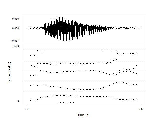
Most of the arguments that can be changed in Praat can also be changed here, including the time step, maximum number of formants, and window length. Unfortunately, forest() doesn’t allow us to change reference levels for the individual formants.
praatpicture('inst/extdata/2.wav', start=0.7, end=1.2,
             frames=c('sound', 'formant'), proportion=c(30,70),
             formant_maxN=4, formant_timeStep=0.01,
             formant_windowLength=0.05)
In lieu of changing reference levels, a useful forest() argument which we can also set with praatpicture is gender, set here to reflect that this is a female speaker:
praatpicture('inst/extdata/2.wav', start=0.7, end=1.2,
             frames=c('sound', 'formant'), proportion=c(30,70),
             formant_maxN=4, formant_timeStep=0.01,
             formant_windowLength=0.05, gender='f')
Intensity can be plotted like so:
praatpicture('inst/extdata/3.wav', start=0.5, end=1.1,
             frames=c('sound', 'intensity'), proportion=c(30,70))
The plotting range can be changed with intensity_range. This is plotted from an IntensityTier Praat file – if one isn’t available, it is calculated using the rmsana() function from wrassp:
praatpicture('inst/extdata/2.wav', start=0.7, end=1.2,
             frames=c('sound', 'intensity'), proportion=c(30,70))
As in Praat, we can edit time step and minimum pitch values. Here I’ve plotted it with a very low resolution just to demonstrate:
praatpicture('inst/extdata/2.wav', start=0.7, end=1.2,
             frames=c('sound', 'intensity'), proportion=c(30,70),
             intensity_timeStep=0.05)
praatpicture allows you to draw arrows or rectangles on individual plot components using the draw_rectangle and draw_arrow arguments. This is done using the base R plotting functions rect() and arrows(). It works like this: You pass the argument a vector containing first the plot component to draw on, and then further arguments you want to pass on to rect() or arrows(); the first four of these should be coordinates on the x and y axis. Here’s an example which draws a rectangle on the spectrogram between 0.15–0.2 seconds, and between 500–4000 Hz.
praatpicture('inst/extdata/3.wav', start=0.5, end=1.1,
             frames=c('sound', 'spectrogram'), proportion=c(30,70),
             start_end_only=FALSE, min_max_only=FALSE,
             draw_rectangle=c('spectrogram', 0.15, 500, 0.2, 4000))
If you want to draw multiple rectangles or multiple arrows, you can pass a list containing vectors with plotting information.
praatpicture('inst/extdata/3.wav', start=0.5, end=1.1,
             frames=c('sound', 'spectrogram'), proportion=c(30,70),
             start_end_only=FALSE, min_max_only=FALSE,
             draw_rectangle=list(
               c('spectrogram', 0.15, 500, 0.2, 4000, border='blue'),
               c('sound', 0.15, -0.01, 0.2, 0.01, border='red')),
             draw_arrow=c('spectrogram', 0.5, 1000, 0.42, 2000, col='darkgreen',
                          lwd=3))
If you are an emuR user, the function emupicture() can do essentially the same as praatpicture(), but with data that you have in an EMU database. Let’s have a look – I’ll create a temporary EMU database here:
library(emuR)
#>
#> Vedhæfter pakke: 'emuR'
#> Det følgende objekt er maskeret fra 'package:base':
#>
#>     norm
create_emuRdemoData(tempdir())
db_path <- paste0(tempdir(), '/emuR_demoData/ae_emuDB')
db <- load_emuDB(db_path)
#> INFO: Loading EMU database from C:\Users\rasmu\AppData\Local\Temp\RtmpMtOtkH/emuR_demoData/ae_emuDB... (7 bundles found)
#>   |                                                                              |                                                                      |   0%  |                                                                              |==========                                                            |  14%  |                                                                              |====================                                                  |  29%  |                                                                              |==============================                                        |  43%  |                                                                              |========================================                              |  57%  |                                                                              |==================================================                    |  71%  |                                                                              |============================================================          |  86%  |                                                                              |======================================================================| 100%
These are the bundles available in the demo database:
list_bundles(db)
#> # A tibble: 7 × 2
#>   session name
#>   <chr>   <chr>
#> 1 0000    msajc003
#> 2 0000    msajc010
#> 3 0000    msajc012
#> 4 0000    msajc015
#> 5 0000    msajc022
#> 6 0000    msajc023
#> 7 0000    msajc057
We can create a Praat Picture style plot of the bundle msajc003 like so (selecting just a snippet of the file, and showing just two tiers, because there are a lot of annotation levels in this database)

All the plotting options we’ve seen above are also available with emupicture(). Additionally, if you have track data for pitch, formants, or intensity stored as SSFF files, you can plot these. Let’s see whether there are any SSFF tracks available in our database:
list_ssffTrackDefinitions(db)
#>   name columnName fileExtension fileFormat
#> 1  dft        dft           dft       ssff
#> 2   fm         fm           fms       ssff
Yup, we have spectral data (dft) and formant data fm. The formant data can be used for plotting formant tracks, if we select formant as one of our frames, and pass the formant track file extension fms to the argument formant_ssffExt. This will produce a Praat Picture style plot from an EMU-DB sound file using SSFF track data! Neat!
emupicture(db, bundle='msajc003', frames=c('sound', 'formant'),
           proportion=c(30,70), start=0.2, end=1.2,
           formant_ssffExt='fms')