This package provides a post processing method to recalibrate fitted Gaussian models. The method is based on the work of Torres R, Nott DJ, Sisson SA, et al. (2024). “Model-Free Local Recalibration of Neural Networks”.
You can install the current version of recalibratiNN with:
# install.packages("devtools")
devtools::install_github("cmusso86/recalibratiNN")

library(recalibratiNN)
Alternately, one can use the pacman package to both install and download.
if(!require(pacman)) install.packages("pacman")
pacman::p_load_current_gh("cmusso86/recalibratiNN")
#> knitr (1.45 -> 1.46) [CRAN]
#>
#> The downloaded binary packages are in
#>  /var/folders/rp/h9_9qkdd7c57z9_hytk4306h0000gn/T//Rtmpe8V57y/downloaded_packages
#> ── R CMD build ─────────────────────────────────────────────────────────────────
#>      checking for file ‘/private/var/folders/rp/h9_9qkdd7c57z9_hytk4306h0000gn/T/Rtmpe8V57y/remotes17255eb14c54/cmusso86-recalibratiNN-6dabb43/DESCRIPTION’ ...  ✔  checking for file ‘/private/var/folders/rp/h9_9qkdd7c57z9_hytk4306h0000gn/T/Rtmpe8V57y/remotes17255eb14c54/cmusso86-recalibratiNN-6dabb43/DESCRIPTION’
#>   ─  preparing ‘recalibratiNN’:
#>    checking DESCRIPTION meta-information ...  ✔  checking DESCRIPTION meta-information
#>   ─  checking for LF line-endings in source and make files and shell scripts
#>   ─  checking for empty or unneeded directories
#>   ─  building ‘recalibratiNN_0.2.0.tar.gz’
#>
#> This example illustrates a common issue of miscalibration. To demonstrate this, we created a heteroscedastic model and fitted it using simple linear regression for visualization purposes.
## basic artificial model example


set.seed(42)
n <- 42000
split <- 0.8

# Auxiliary functions
mu <- function(x1){
10 + 5*x1^2
}

sigma_v <- function(x1){
30*x1
}

# generating heterocedastic data (true model)

x <- runif(n, 1, 10)
y <- rnorm(n,mu(x), sigma_v(x))


# slipting data
x_train <- x[1:(n*split)]
y_train <- y[1:(n*split)]

x_cal <- x[(n*split+1):n]
y_cal <- y[(n*split+1):n]

# fitting a simple linear model
model <- lm(y_train ~ x_train)
In the graph below, you can observe the true mean, the data points, and the regression line. The linear model, represented by a dashed black line, consistently underestimates the mean for both small and large values of \(x\). Additionally, it overestimates the variance at lower values of \(x\), as indicated by all points falling within the confidence interval (CI). Conversely, at higher values of \(x\), the model underestimates the true variance. These discrepancies highlight the model’s inability to accurately quantify uncertainty, showcasing it as an example of a miscalibrated model.
pacman::p_load(tidyverse)
pacman::p_load_gh("AllanCameron/geomtextpath")

# use predict to get the confidence intervals
data_predict <- predict(model,
                        newdata=data.frame(x_train=x_cal),
                        interval = "prediction") %>%
  as_tibble() %>%
  dplyr::mutate(x_cal=x_cal,
                y_cal=y_cal,
          CI=ifelse(y_cal<=upr&y_cal>=lwr, "in", "out"))

data_predict %>%
  ggplot(aes(x_cal))+
  geom_point(mapping=aes(x_cal, y_cal, color=CI), alpha=0.6)+
  geom_labelline(aes( y=mu(x_cal), label="True Mean" ),
                 size=1.8, hjust=-0.01, linewidth=0.7, color="red" )+
  geom_smooth(aes( y=y_cal ), color="black",se=F,
                   method="lm", formula=y~x,linetype="dashed" )+
  scale_color_manual("IC 95%", values=c("#00822e", "#2f1d86"))+
  theme_classic()
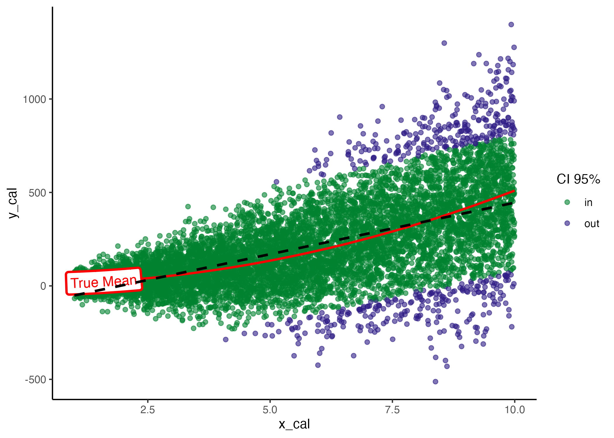
Model coverage, true mean (red) and estimated mean (black dashed line).
In real-world scenarios, especially with higher-dimensional models, evaluating miscalibration as described above is not feasible . A widely used method for assessing global calibration in such cases is through the analysis of Probability Integral Transform (PIT) values. PIT values quantify the estimated cumulative probability of the observed values within the predicted distribution. This approach involves generating a histogram or density plot of the cumulative distribution functions predicted by the model for each observation. A well-specified model will yield a distribution that closely resembles a Uniform distribution.
To obtain PIT values for the fitted model using a calibration set, we first use the PIT_values() function. This requires some preliminary calculations that will be used as arguments: predicted values of the fitted model for new observations (using predict); the Mean Squared Errors for the validation set, which in this context is referred to as the ‘calibration set’.
library(recalibratiNN)

# predictions for the calibration set
y_hat <- predict(model,
                 data.frame(x_train = x_cal))

# MSE from calibration set
MSE_cal <- mean((y_hat - y_cal)^2) # a little different from MSE from training set

# USE tha recalibratiNN::PIT_local() to calculate the pit-values.

pit <- PIT_global(ycal=y_cal,
                  yhat=y_hat,
                  mse=MSE_cal)

head(pit)
#> [1] 0.04664277 0.32280556 0.58780953 0.94944249 0.67383645 0.15426510
Following these steps, you can then visualize the histogram and assess its fit to a uniform distribution using the gg_PIT_global() function. For additional customization options, refer to the function’s documentation.

In this instance, as we are fitting a linear model (lm()) to a heteroscedastic model it is expected that the histogram indicated miscalibration. Additionally, the image includes the p-value from the hypothesis testing using the Kolmogorov-Smirnov test, conducted with the ks.test() function from the stats package.
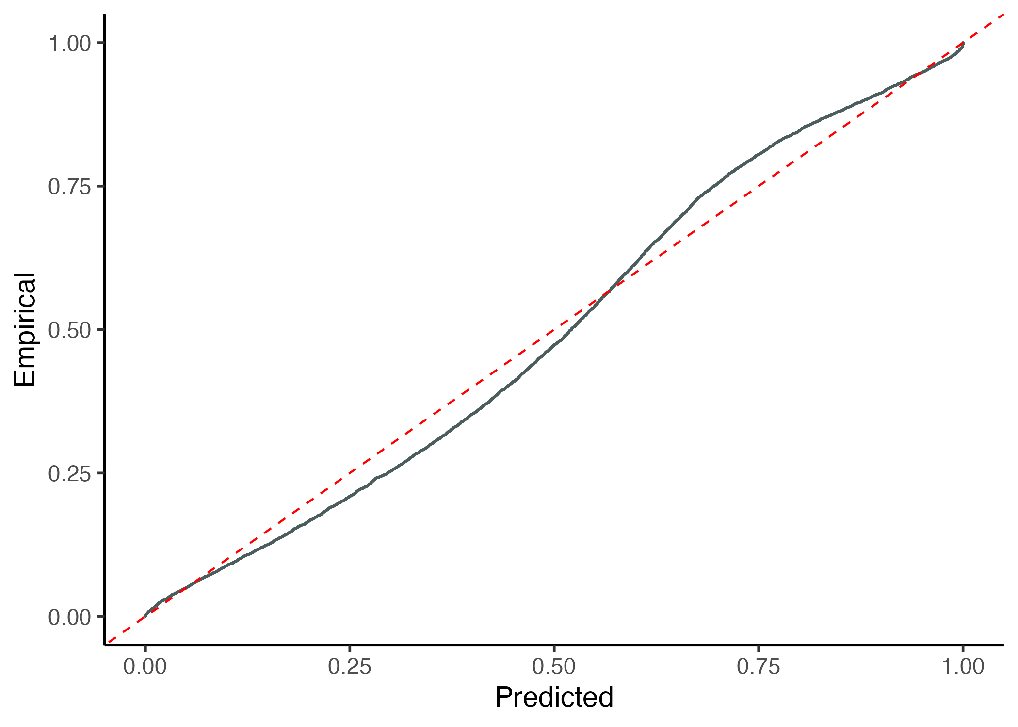
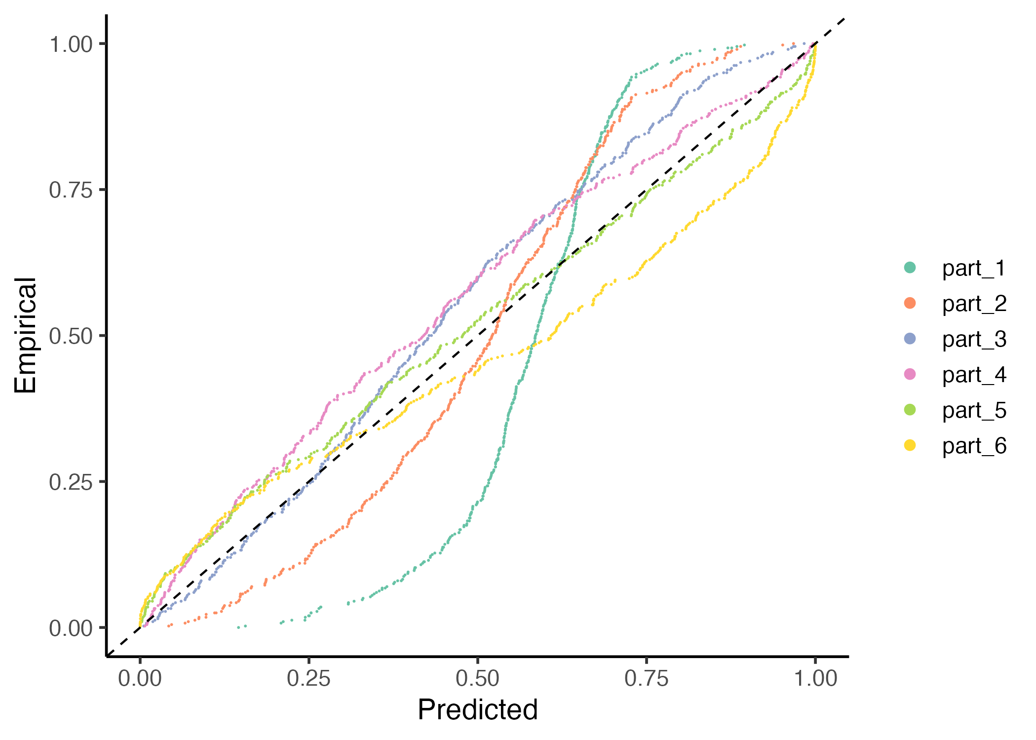
It is also to use other visualization function of the package with the gg_CD_global. This graph shows the cumulative predictive distribution in the x-axis versus the empirical cumulative distribution and require four parameters.
However, relying solely on global calibration can be deceptive. A model may appear well-calibrated on a global scale, yet exhibit significant issues on a local level. For example, the model in question demonstrates a coverage close to 95%, aligning with the expected 95% confidence interval. Nonetheless, a closer inspection reveals that the distribution of errors is not uniform. In certain regions, the model consistently exhibits greater inaccuracies, indicating systematic errors.
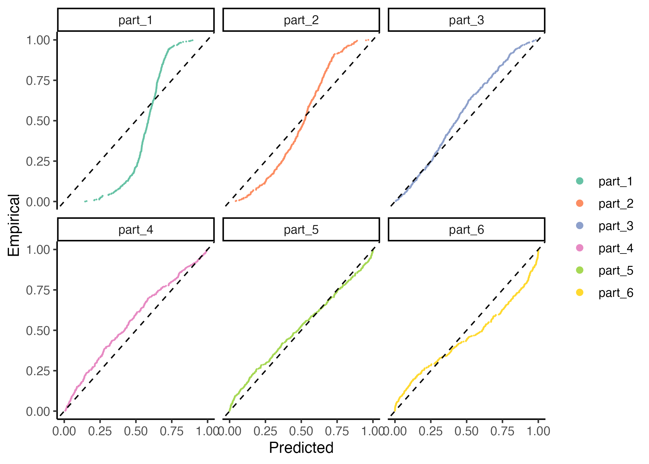
The observed disparities are evident in the graphs below. To analyze these, we first compute local PIT values using the PIT_local() function. This function divides the covariate space into ‘n’ clusters, with a default of 6, using a k-means algorithm. It then identifies neighbors around the centroids of each cluster.
Observing this graph, we notice the model is uncalibrated in different ways thoughout the covariates space.
# calculating local PIT
pit_local <- PIT_local(xcal = x_cal,
                       ycal= y_cal,
                       yhat = y_hat,
                       mse = MSE_cal)

gg_PIT_local(pit_local)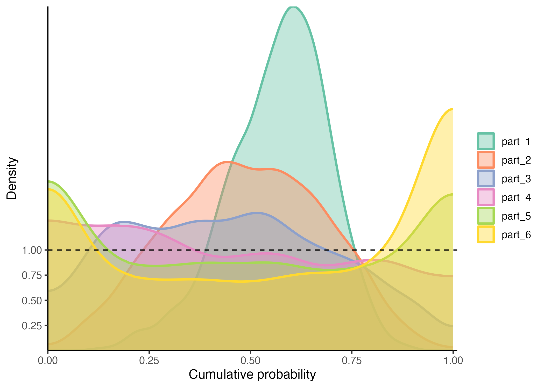
In the initial segment, the model overestimates the variance while underestimating the mean. In contrast, the middle region shows better calibration, with the model’s predictions aligning more closely with observed values. Towards the end, however, it underestimates the variance. These distinct behaviors in different partitions of the data clearly suggest that the model would benefit from local calibration, as each section exhibits unique calibration needs.
Alternatively you can observe the local miscalibration in the QQ-graph.
This Quantile recalibration method produces Monte Carlo samples from a predictive distribution, which is unknown yet expected to be more calibrated. This process also yields recalibrated estimates of the weighted mean and variance.
The recalibrate() function implements the method described by Torres et al. (2023), drawing inspiration from Approximate Bayesian Computation. This method can be applied globally or locally. In our heteroscedastic example, local calibration shows superior performance. It employs a KNN algorithm to identify the nearest neighbors from the calibration set to the new or test set provided.
To execute recalibration, it’s essential to supply the global PIT values, irrespective of the recalibration type, along with the Mean Squared Error of the calibration set. The neighbor search can be conducted at the covariate level, at any intermediate layer (as in a Neural Network), or even at the output layer.
The function calculates the PIT values and employs the Inverse Transform Theorem to generate recalibrated samples. By default, the size of the vicinity is set at 10% of the calibration set, but this can be customized using the p_neighbours argument.
# new data
x_new <- runif(n/5, 1, 10)
y_hat_new <- predict(model,
                     data.frame(
                       x_train=x_new)
                     )

# recalibration
rec <- recalibrate(yhat_new = y_hat_new,
                   space_new = x_new,
                   space_cal = x_cal,
                   pit_values = pit,
                   mse = MSE_cal,
                   type = "local",
                   p_neighbours=0.2)
Now, we possess a list of new parameters and Monte Carlo samples from a predictive distribution that is expected to be calibrated. Although the exact form of this new distribution is unknown, we can estimate its parameters.
To look for more examples of successful application of this method in the calibration, please refer to Torres et. al (2023).
For this exercise, we’ll deviate slightly from standard practices and assess the calibration on our test set, referred to here as the ‘new set.’ This deviation is permissible in our artificial example because we know the true model/process that generated the data. Consequently, we can compute the empirical PIT values to determine if the predictions are now better calibrated. It’s important to note that this is purely an educational exercise; in real-world scenarios, such an approach might not be feasible. Additionally, this specific evaluation method is not implemented in the package and is presented here solely to illustrate its effectiveness in this scenario.
Note that since we dont know the real distribution, we can only calculate the empirical PIT-values, and not the ones provided ny the Inverse Transform Theorem.
# what youd be the real observations in this example
y_new_real <- rnorm(n/5,
                    mu(x_new),
                    sigma_v(x_new))

# retrieving the weighted samples
y_hat_recalib <- rec$y_samples_calibrated_wt

# empirical p-value distribution
pit_new <- purrr::map_dbl(
  1:length(y_new_real), ~{
    mean(y_hat_recalib[.,] <=y_new_real[.] )
  })

gg_PIT_global(pit_new)
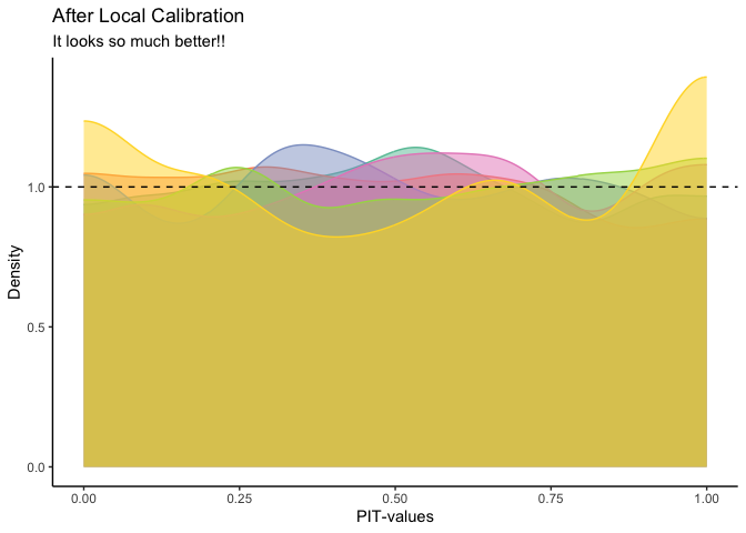
We see now that the pit-values are approximately uniform, at least globally. Bellow, we also see that the local calibration is improved.
n_neighbours <- 800
clusters <- 6

# calculating centroids
cluster_means_cal <- stats::kmeans(x_new, clusters)$centers
  cluster_means_cal <- cluster_means_cal[order(cluster_means_cal[,1]),]


# finding neighbours
knn_cal <- RANN::nn2(x_new, cluster_means_cal,  k=n_neighbours)$nn.idx


# geting corresponding ys (real and estimated)
y_new_local <- purrr::map(1:nrow(knn_cal),  ~y_new_real[knn_cal[.,]])
y_hat_local <-purrr::map(1:nrow(knn_cal),  ~y_hat_recalib[knn_cal[.,],])


# calculate pit_local

pits <- matrix(NA, nrow=6, ncol=800)
for (i in 1:clusters) {
    pits[i,] <- purrr::map_dbl(1:length(y_new_local[[1]]), ~{
      mean(y_hat_local[[i]][.,] <= y_new_local[[i]][.])
    })
}


as.data.frame(t(pits)) %>%
  pivot_longer(everything()) %>%
  ggplot()+
  geom_density(aes(value,
                   color=name,
                   fill=name),
               alpha=0.5,
               bounds = c(0, 1))+
  geom_hline(yintercept=1, linetype="dashed")+
  scale_color_brewer(palette="Set2")+
   scale_fill_brewer(palette="Set2")+
  theme_classic()+
  theme(legend.position = "none")+
  labs(title = "After Local Calibration",
       subtitle= "It looks so much better!!",
       x="PIT-values", y="Density")